|
Two kinds of graph can be generated by Cacti:
|
Table of contents Contributors
No contributors found for: authors on selected page(s)
|
Using a simple data
This is done using a simple script/command based on Petals CLI to collect metric values.
Required input parameters are:
- the command line to use with its arguments and input fields,
- output fields
To create such a graph, please follow the following steps:
- First, create a new Data Input Method:
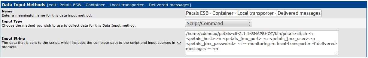
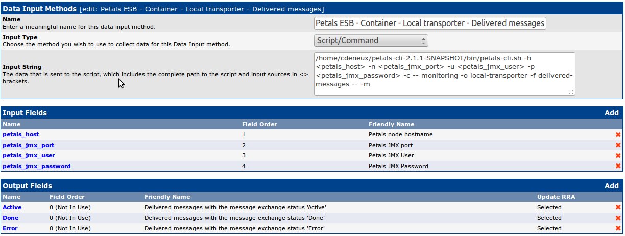
Cacti monitoring extension of Petals CLI is used to get metric values. See the documentation of Petals CLI for more information.
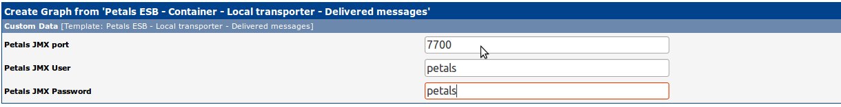
In the Input String, you will put the command line arguments to connect to the the Petals node for which you want to graph the delivered messages of the local transporter. That's why the command line contains: <petals_host>, <petals_jmx_port>, <petals_jmx_user> and <petals_jmx_password>. - Add an input field for your Petals node hostname
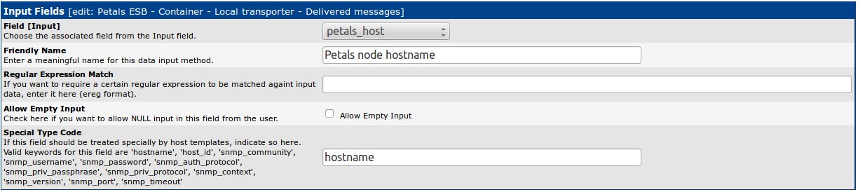
As the Petals node hostname can be automatically set from the hostname of the monitored host, the field Special Type Code is set. - Add others input fields
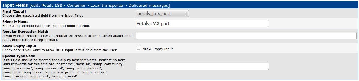
As for the JMX port, create an input field for the Petals JMX username and the Petals JMX user password. - Add the output fields returned by the script
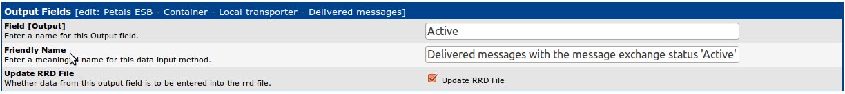
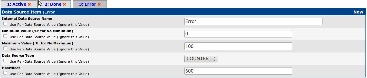
For each output fields of the script/command (here, in the sample, for each message exchange status "Active", "Done" and "Error"), create an output field:
- Check that you have the following Data Input Method:
- Create a new Data Template:
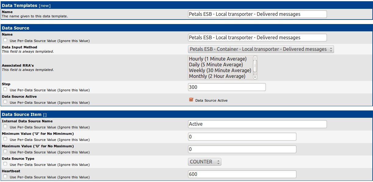
Select your data input method previously created as Data Input Method.
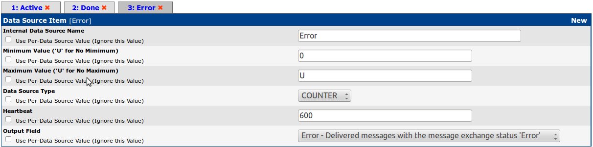
Add your first data item associated to an output field of the script/command previously created (here in the sample, the number of delivered messages for message exchange status 'Active'). The data source type of the item must be correctly set according to the output field type. - Create the others data items associated to the remaining output fields
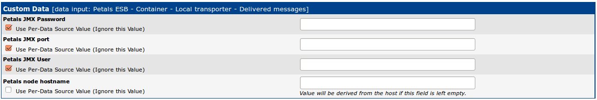
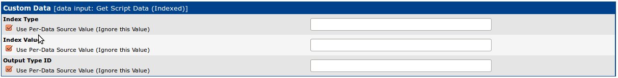
- A new block Custom data appears, check Use Per-Data Source Value for all except for the Petals node hostname
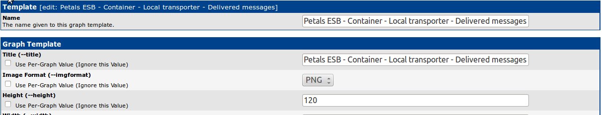
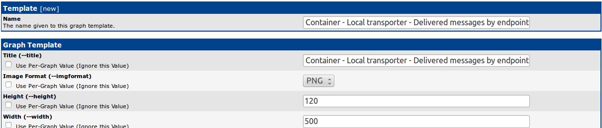
- Create a new Graph Template:
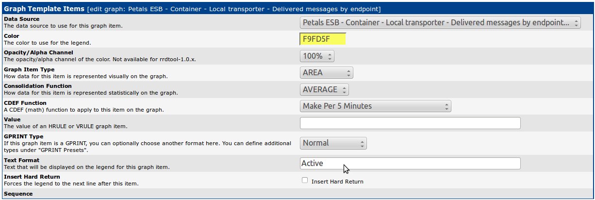
- Add a Graph Item to graphed one of the previous data item (here in the sample, the number of delivered messages for message exchange status 'Active')
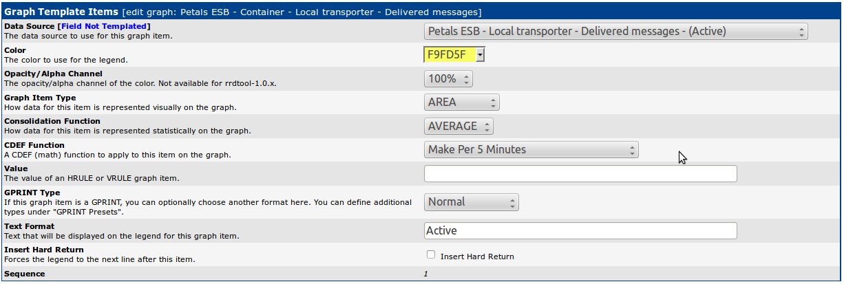
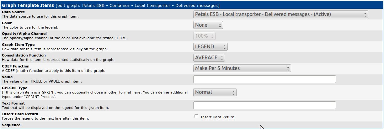
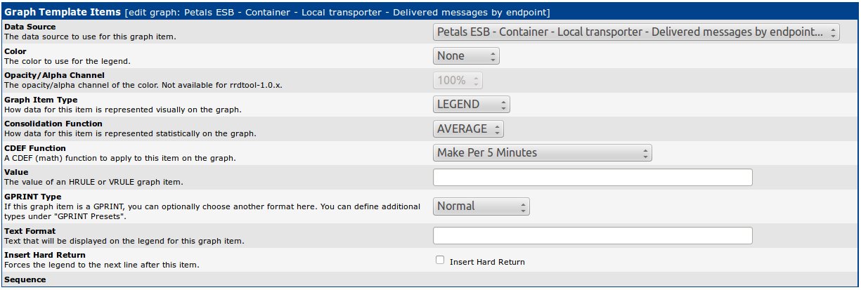
- Add a Graph Item to displayed the legend of your data item (here in the sample, the number of delivered messages for message exchange status 'Active')
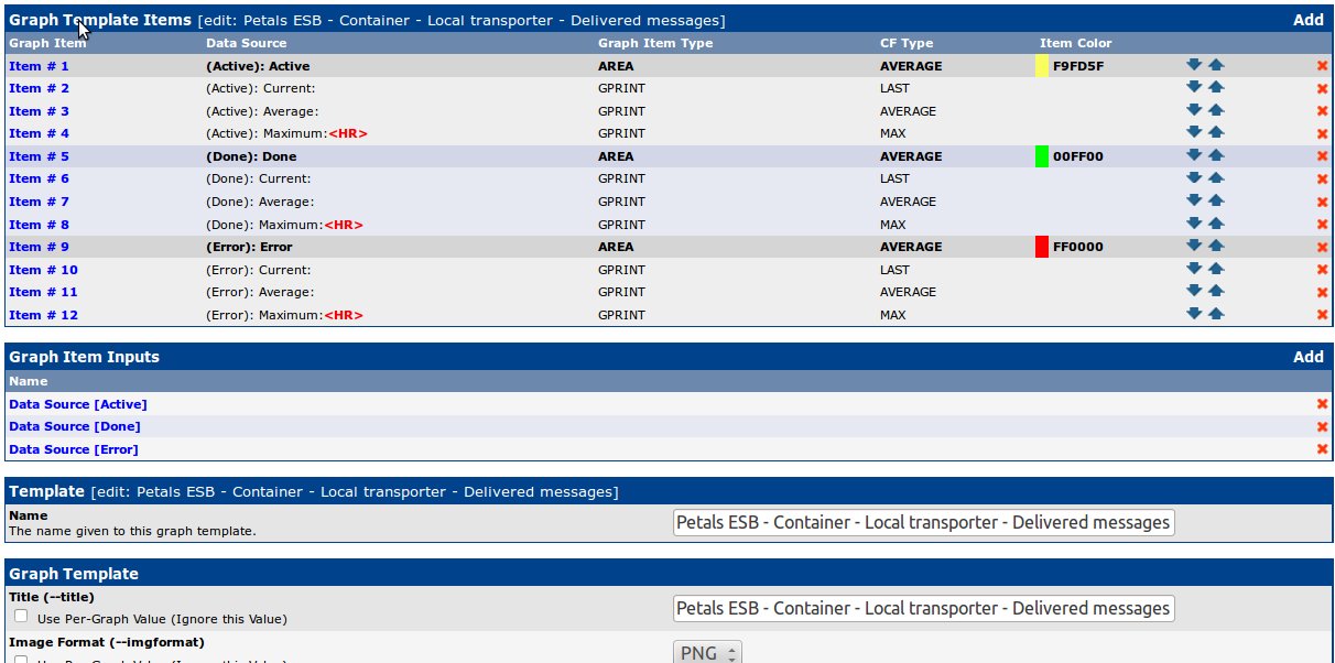
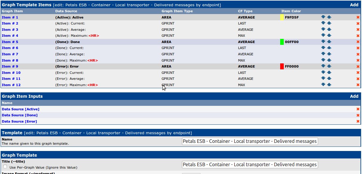
- Add others Graph Items associated to the remaining data items
- Create a New Graph
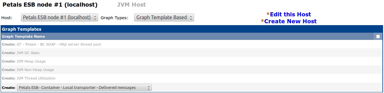
- Set parameters needed to the Data Input Method
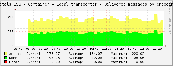
The new graph can be viewed after several minutes needed to collect data. By default a collect is done every 5 minutes. To view the graph, go into *Graph management"
Using a data query
This is done using a data query to collect metric values.
Required input parameters are:
- the data query,
- the output fields.
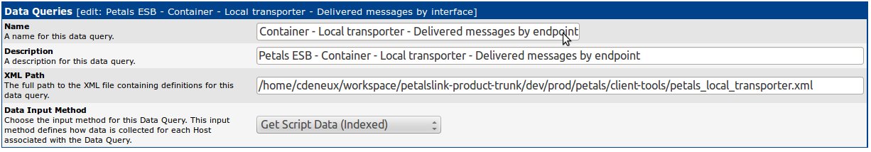
The data query definition of our sample to put in the XML file is:
<interface>
        <name>Get Delivered Messages by the Local transporter to an endpoint</name>
        <script_path>/home/cdeneux/petals-cli-2.1.1-SNAPSHOT/bin/petals-cli.sh</script_path>
        <arg_prepend>-h localhost -n 7700 -u petals -p petals -c -- monitoring -o local-transporter -f delivered-messages</arg_prepend>
        <arg_index>-- --list-endpoints</arg_index>
        <arg_query>-- --query-endpoints</arg_query>
        <arg_get>-- --query-endpoints</arg_get>
        <output_delimeter>!</output_delimeter>
        <index_order>endpointName</index_order>
        <index_order_type>alphanumeric</index_order_type>
        <!--index_title_format>|chosen_order_field|</index_title_format-->

        <fields>
                <endpointName>
                        <name>Endpoint name</name>
                        <direction>input</direction>
                        <query_name>NAME</query_name>
                </endpointName>
                <activeDeliveredMsgs>
                        <name>Active Message exchange delivered counter</name>
                        <direction>output</direction>
                        <query_name>ACTIVE</query_name>
                </activeDeliveredMsgs>
                <doneDeliveredMsgs>
                        <name>Done Message exchange delivered counter</name>
                        <direction>output</direction>
                        <query_name>DONE</query_name>
                </doneDeliveredMsgs>
                <errorDeliveredMsgs>
                        <name>Error Message exchange delivered counter</name>
                        <direction>output</direction>
                        <query_name>ERROR</query_name>
                </errorDeliveredMsgs>
        </fields>
</interface>
Don't forget to adapt the path of Petals CLI to your installation. Petals CLI is used to collect data. See the documentation of Petals CLI for more information.
To create this graph, please follow the following steps:
- First, create a new Data Query:
- Go to the device for which you want collect metric values, and associate it to the data query previously created

- Create a new Data Template:
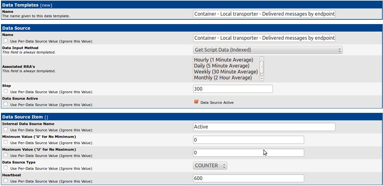
Select "Get Script Data (Indexed)" as Data Input Method.
Add your first data item associated to an output of the data query (here in the sample, the number of delivered messages for message exchange status 'Active'). The data source type of the item must be correctly set according to the output field type. - Create others data items associated to the remaining output fields (here in the sample, number of delivered messages for message exchange status 'Done' and 'Error')
- A new block Custom data appears, check Use Per-Data Source Value for all
- Create a new Graph Template:
- Add a Graph Item to graphed one of the previous data item (here in the sample, the number of delivered messages for message exchange status 'Active')
- Add a Graph Item to displayed the legend of your data item (here in the sample, the number of delivered messages for message exchange status 'Active')
- Add others Graph Items associated to the remaining data items
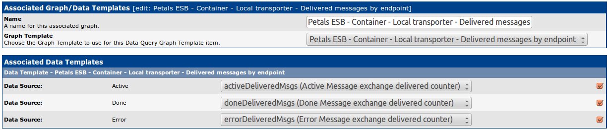
- Go to the data query previoulsy created, and associate it to the just create graph template

- Associate outputs of the data query to the graph items
Don't forget to check boxes. - Go to the device for which you want to create the graph, and Create Graphs for this Host
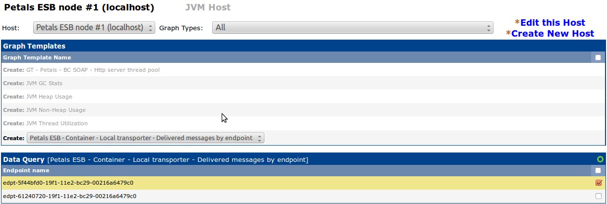
Select yours endpoints for which you want create a graph
The new graph can be viewed after several minutes needed to collect data. By default a collect is done every 5 minutes. To view the graph, go into *Graph management"