 E-mail
Features and functionalities:
The administration view provide several features, splintered into five tabs:
- The first for current server endpoints.
- The second for current server components.
- The third for current server service assemblies.
- The fourth for current server shared libraries.
- The fifth for current server properties/parameters.
Endpoints administrative tab
This tab contains a table where each recovered server endpoint is displayed. Each
row provide several informations on the current endpoint, like :
- The endpoint name
- The service name
- The interface name
- The component holder
- And a link to the associated wsdl file

 Warning: If Petals ESB don't correctly send back the wsdl file, it's sometimes possible
that the link don't work.
If you have a lot of endpoints displayed, the table will automatically paginate the render, and
if you need to sort the rows for example by endpoint name, you only need to click on the column
title:

 Information: Think to click on the "Refresh domain", if nothing endpoint is displayed or if you are sure that
one is missing into the table.
Components administrative tab
The main purpose of this tab is to give you access to several administrative features, for each
component present on the current server. But this tab also provides to you a lot of valuable
informations into a table, each row represent a component found for the current server and
display its component name (example: petals-se-rmi, petals-bc-soap, ...), its component type
(binding component, service engine) and an interesting information the component state that
can serve as a sorting filter in the table rendering.
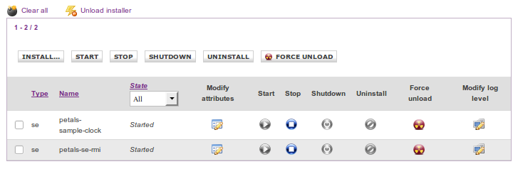
Each table columns allow to perform different action on the associated component of the row:
| Icon |
Action |
|---|---|
 |
This first icon allows to start the associated component, It must be into stop or shutdown state. |
 |
This icon provides the possibility to stop a started component, on the current server. |
 |
The shutdown icon give you the possibility to shutdown a component, but it must be stopped first. |
 |
Uninstall action can be performed by this icon, the associated component must be shutdown first. |
 |
The action performed by this icon is very radical, it's as if you try to uninstall and unload the associated component. It try to force the uninstall and unload action. |
 |
Icon for performing a logger level modification, on the component associated with the row. |
 |
Access to runtime component attributes can be allowed thank to this icon, but the component must be previously started to return the runtime attributes. |
The toolbar associated to the table allows you to perform the previous action,
but for all selected component thank to checkbox associated to the row:
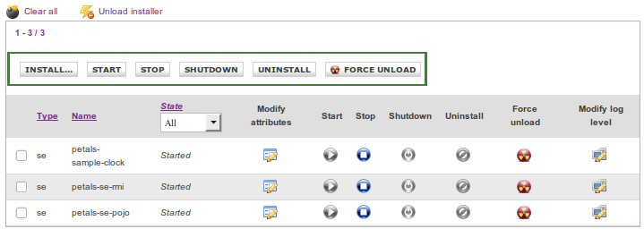
Warning: Only one action is performed for all components instead if you
haven't selected them: 
It allows you to clear the current server by removing all components (and
associated service assemblies on each), installers and bootstraps ...
As its name indicates, this action aims to clean up the current server.
The following icon:  provides the feature to unload specified installer, in
case of one component was wrongly installed or an installation isn't completed.

You can select all loaded component installers which you like to unload, click on Unload button:
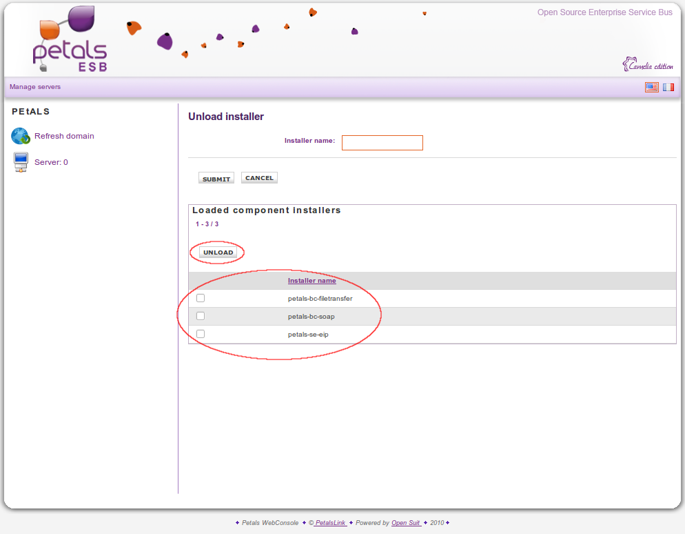
Otherwise you can provide the component installer name and click on Submit button:

The following gray icons mean, that associated component isn't in state
condition to perform the following action:


For example: For the stop icon becomes colored, the associated component must be in start state
Shared libraries administrative tab
This tab contains administrative management for all shared libraries of the current server. The table
contained into this view display each recovered shared library. Although, unless actions are
possible on the shared libraries, some still available like: install, uninstall
| |
Uninstall action can be performed by this icon, on the associated shared library. |
For associated informations, only shared library name is displayed:
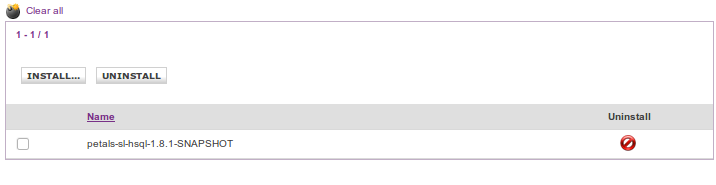
: provides the same action as for component, but applied to shared libraries.
Following this action all shared libraries on the current server should be uninstalled.
Service assemblies tab
This administrative view tab allows to display several informations about recovered service assemblies
on the current selected server. Thank to this tab you can perform several interactions on each deployed
service assembly, actions here are the same that the components tab.

Several informations like service assembly name or the current service assembly state are displayed.
Each table columns allow to perform different action on the associated service assembly of the row:
| Icon |
Action |
|---|---|
| |
This first icon allows to start the associated service, assembly It must be into stop or shutdown state. |
| |
This icon provides the possibility to stop a started service assembly, on the current server. |
| |
The shutdown icon give you the possibility to shutdown a service assembly, but it must be stopped first. |
| |
Uninstall action can be performed by this icon, the associated service assembly must be shutdown first. |
| |
The action performed by this icon is very radical, it's as if you try to uninstall and unload the associated service assembly. It try to force the uninstall and unload action. |
: provides the same action as for component, but applied to service assemblies.
Following this action all service assemblies on the current server should be uninstalled
and unloaded.
Server properties tab
This administrative view tab allows to display and set several properties/parameters for the
current server, for the time being just purge properties can be set.
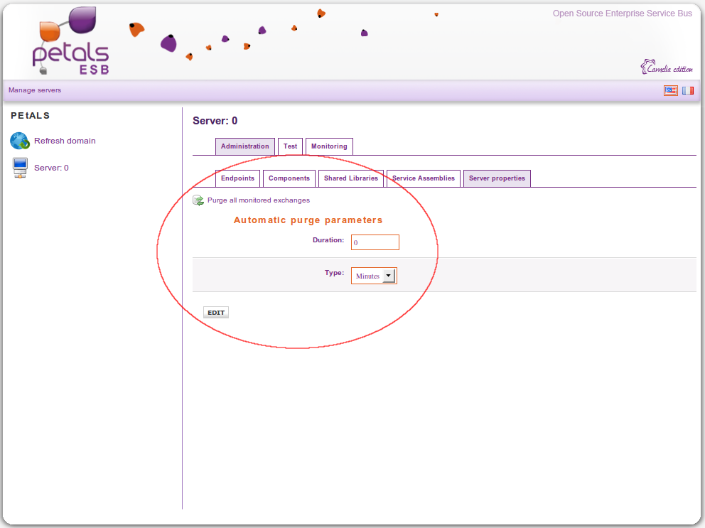
The following button  allow you to immediately purge all monitored exchanges, whereas
the form below allow you to set the parameter for automatic purge.
You can set the duration which exchanges is stored in database (the duration can be
expressed in minute, hour, day).
Artefacts installation
On each linked tab, you can install service assembly, shared library and component,
the following screenshot can give you an idea of the installation page:

If the installation correctly work the deployed artefact is displayed, but if isn't
correctly installed a error message you are returned. Two installation result behaviours
are different for component and service assembly, during the component installation
you can set installation component attributes thank to the following form:
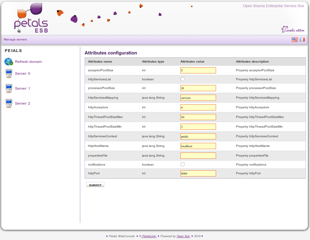
Certain attributes are common for all components like: acceptorPoolSize, processorPoolSize, notifications ...
But several attributes are very specific on each component, example : httpHostName, httpPort, httpAcceptors ...
are only linked to the petals-bc-soap component installation.
After service assembly installation, the result is displayed:
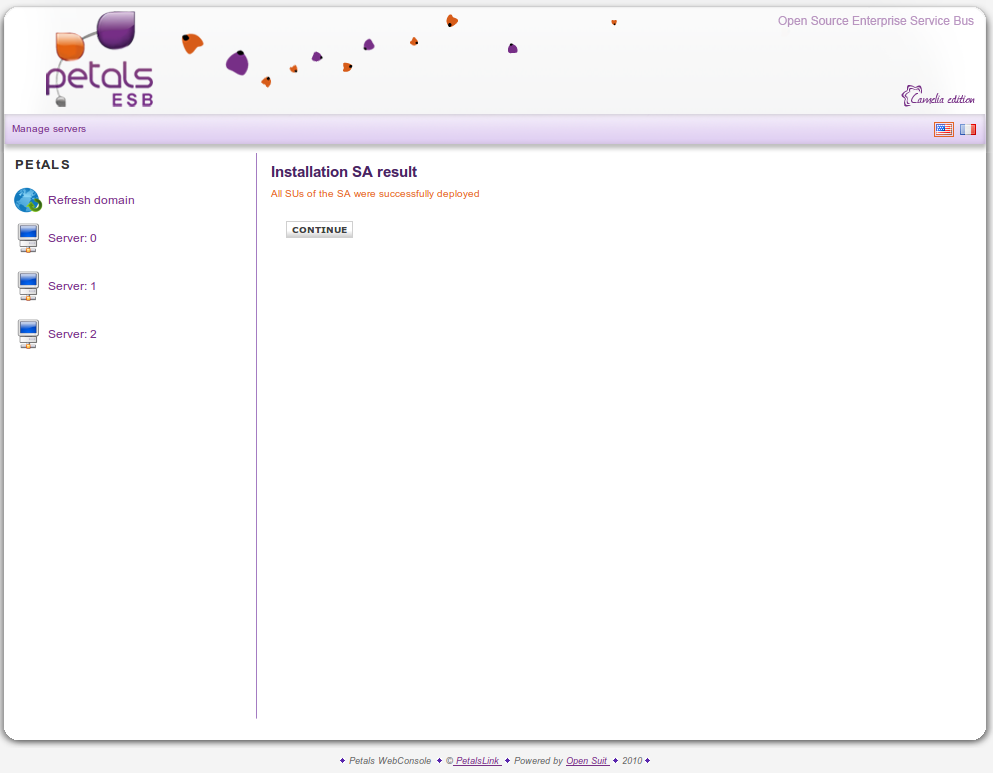
The previous screenshot result mean that all service units of the current service assembly are correctly installed,
but sometimes the installation result can inform that one or more service unit deployments have failed, during the
service assembly deployment on the current server.
Runtime features
Two runtime features are provided thank to these following icon into component table:
: allows modify the logger level of the specified component.
: allows to modify runtime component attributes for the specified component.
The following screenshot represent the page where you can modify the logger level
of a component:
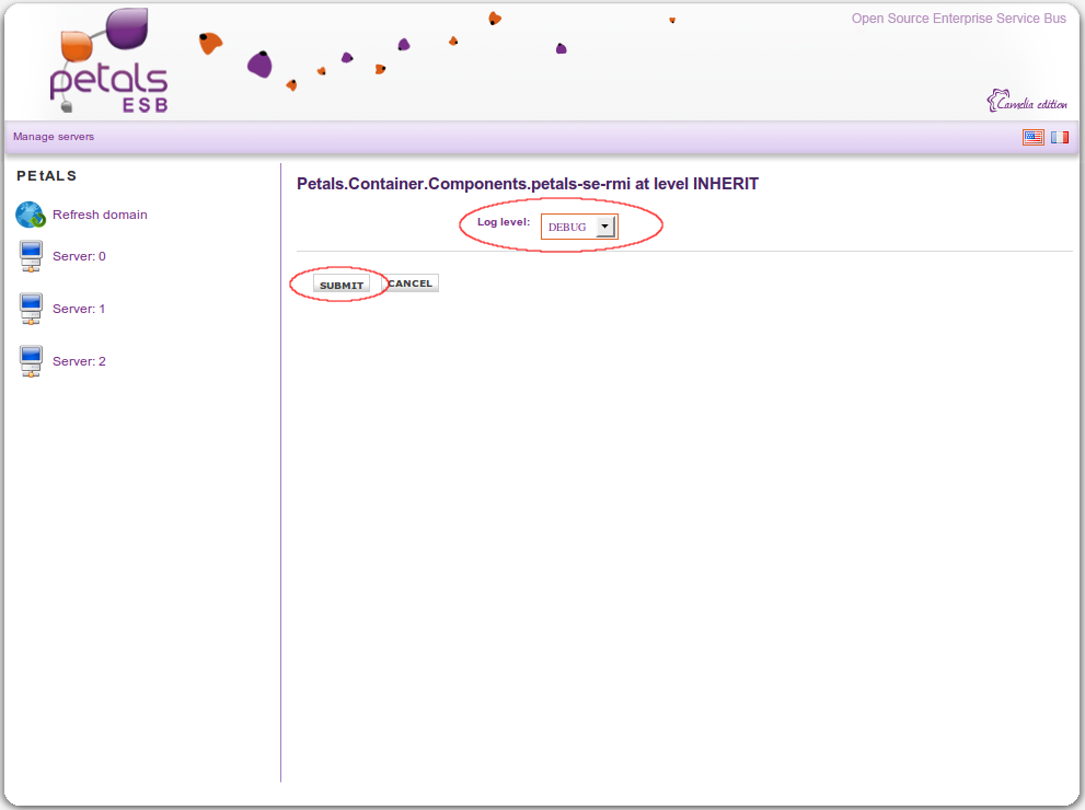
Warning: several values are available (ERROR, FATAL, WARN, INFO,
INHERIT, DEBUG) but you need to set it by paying attention to the meaning of
each value, because the change will impact the component deployed into the
associated server.
You can access to changing component logger level functionnality by clicking
on the following button:

For the feature that allows to modify the runtime component attributes, the
following form is dynamically generated in order to display each attributes
discovered for the current component:
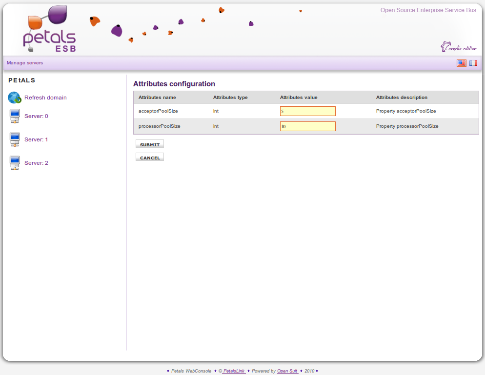
Information: We advise you to refer to component documentation to know the
meaning of each attributes.